Deconstructing the Blend Fest Animation
I have always felt a deep fascination for the Blend Festival 2015 animation, and since then I have had the privilege of taking Sander's class. Sander Van Dijk took us through the middle section that he animated, explaining what makes a great transition. Using what I've learned I’m going to deconstruct the first quarter of the Blend Fest Manifesto which was animated by Jorge Canedo Estrada.
Landscape transition
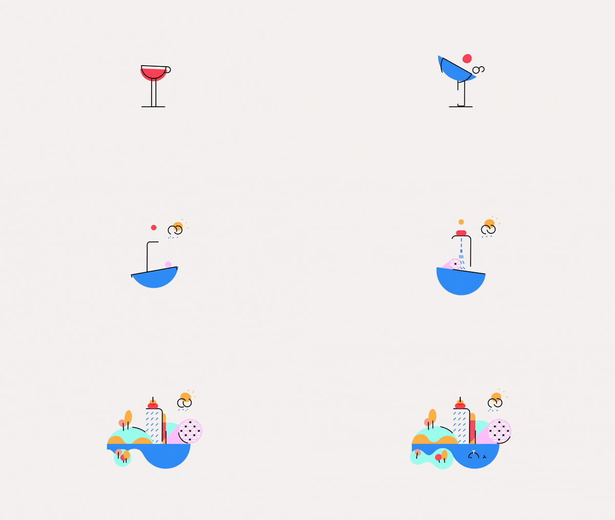
The “wine after coffee” logo emerges beautifully. After a lot of bouncing, the ball generates loads of momentum by bringing up a bunch of elements which hang in the air for a split second (creating expectation) and then are heavily brought down by the bouncing ball, to then rapidly merge into the logo. So cool.
The transition from the logo to the cute landscape is seamless, you hardly notice what’s happening by the time you're at the new style-frames. He probably began by looking for elements that the logo and the landscape had in common: like the black rectangle, the shape of the red semicircle and the handle of the cup. Then he created a more simple illustration of the landscape so that he could first transition to that, before adding all of the other elements. He makes those objects transition in a single rotation of the water. After that super crazy transition, the viewer might need a rest to take everything in, but only a little rest, because then the landscape scales outwards and the rest of the elements that weren’t in the logo have simply scaled up.
Speech bubbles
For the next transition, our attention is drawn to the pink element, because it is the fastest thing to move, and also the first thing to move. Then the turquoise shape also rotates and morphs into a speech bubble and then both speech bubbles rotate in the opposite direction. This rotation and anti-rotation produces a balanced motion.
The next transition rotates in the opposite direction (notice a pattern here?), scales down and then up. These movements are usually expected by the viewer, because when you rotate something one way, it’s very satisfying to watch it rotate the other way, and when something scales down it’s cool to have it scale back up again. It’s satisfying to watch because it’s expected. But after so much expectation has been met, something unexpected should happen right? Otherwise… boooring.
Jorge is the opposite of a boring animator so, after everything scales back up, the elements are left hanging, which leaves you hanging. These unexpected moments help create tension, which makes the viewer focus on the content of the video so much more. After that pause, there’s a sudden movement from a red ball, which jumps out from the sea of hovering elements and launches into the next scene.
That was a lot of deconstruction for 15 seconds of video. That’s because it probably took quite a bit of intense work to animate. For me, one of the things that makes this piece awesome is its transitions: a lot of thought has been put into them. They aren’t simple but they are seamless and effortless and they guide the viewers eye perfectly throughout the piece.
Unexpected motion


